
Keep in mind I am a designer by trade, so a couple of the things I show you today may be too advanced if you're a beginner! I will make sure that the series I create is accessible for all skill levels, but for now, here's a step by step on how I created the product shots for my Strawberry and Rhubarb Crumble recipe! Don't be put off by the length of this, I'm writing in detail. This photo edit takes around 5 minutes (maybe 15-30 if you're still learning!)
Before (straight from camera)

After some Photoshop magic

I will go into more detail in my series of posts about this, but basically what you see below is a length from a roll of paper (purchased at Ikea, but you could easily use any large sheet in any color). It is long enough to tape against the back of my kitchen wall, and then run over the bench surface (with a soft curve from the wall to the bench surface). I don't have any lights, just a window to the left of the image, which gets indirect natural light for most of the day. I also have another sheet of paper propped up on the right hand side to act as a reflector. It just casts the tiniest bit of extra light back onto the shaded side on my subject (the side opposite the window), which creates a more even lighting that suits food photography. It also works well for product shots.

That's all I've done before taking the image to Photoshop. Obviously camera settings are important, I shot in full manual with a tripod in order to control everything myself. That's a whole other kettle of fish, let me know if you want me to cover some camera basics in my series as well!
Once in Photoshop (or any other photo editor, they are all similar), I always open my jpeg image from the camera and immediately save as a Photoshop document. This preserves your layers and lets you edit the image later on if you need to. I also ALWAYS, always keep my 'background' layer i.e. the original image untouched. If you are going to edit it, duplicate it first. That way, if you make a mistake you can always go back to the original! Now here is what I did for this image. It is by no means the 'formula' for creating this kind of image, but it is one way. The more you use image editing software, the more you realise there are infinite ways to do one thing!

- Add a new layer to your file (Rename to "Cream")
- Choose a foreground color that is the same or similar to your paper backdrop, I chose a warm creamy white to complement my strawberries and give a warm, natural feeling to my image.
- Fill your new layer with your selected color (Edit > Fill)
- Hit Save

- Duplicate your "Background" (original image) layer. (Rename to "Luminosity")
- Place your photograph layer on top of the background fill color
- Change the 'Blending Mode" of your image to "Luminosity" What this does is tell your image to only show it's luminance (light value), and the layer below's (our cream layer) Color and Saturation values. Put simply, it keeps your shadows and highlights, but turns everything else the shade of the layer below, in our case, the cream layer.
- Hit Save

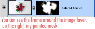
- Duplicate the Background layer again. (Rename to "Colored Berries")
- Put this layer on top of everything else in your layer stack.

- Add a layer mask. What this is, is a mask in the literal sense. We are going to paint on it in black and white (and grey). Anything black makes your masked layer transparent, and anything white makes it opaque (solid) We use this as it is NON-destructive. It is like erasing parts of your layer, with the option to put them back in again and refine it endlessly.
- Make sure your mask is selected by clicking on the 'mask' thumbnail. You will know when it has a little frame around it whether you are working on the layer or the mask.
- With the mask selected, fill it with black. You will now see your black and white "Luminosity" layer only. This is because the black fill makes your mask completely transparent. We now want to paint in some color, but JUST the strawberries, so that the background retains the nice creamy color we've made.
- With the mask selected, choose your brush tool.
- Make the foreground color white.
- Using a soft brush, gradually paint the mask layer white only over the strawberries. (You still paint on the image as you normally would, but with the mask layer selected it affects the mask, not your image
- You can see my messy mask here, it's not perfect but it works, especially when the image is reduced for web. If I was doing this for print, I would be much more precise and careful.
- Hit Save
Brighten your image!

- Create a new "Curves" Adjustment Layer, by clicking this button (Make sure it's on top of your layer stack)

- You can adjust several sections of your image in the curves adjustment, RGB, Red, Green or Blue. We want to adjust the RGB which is the whole image.
- A standard adjustment is the "s" curve which bumps up your contrast, but in this instance, we want to make everything a bit brighter. Don't adjust too much, it's best to be subtle. Just grab the line on the bottom left third and raise it a up a little. This brightens the darker parts of your image. Then grab the line on the top right third and raise it a little. This brightens the lighter parts of your image.

- You can adjust the curves on a layer directly, but once again, with this method, you can turn it off and on, and your original layer remains intact. Adjustment layers usually affect everything underneath them in the layer stack (unless you make it a clipping mask, which is more complicated) In this case we want it to brighten everything below, so go ahead and >
- Hit Save

When I work, I always work in high resolution, straight from my camera. I then save this 'working' PSD file in high res. For using the image online, I resize to 600px wide (constrained proportions, 72dpi), whether it is landscape or portriat, that way my images always line up and have a consistent width. ALWAYS save as a copy. Now you have a high res in case you want to use it again, maybe to print? And a low-res for uploading to the web.
I know that was long, but I wanted to explain the HOW and the WHY. I hope it all made sense. Please ask in the comments section if you have any questions. I know some people hate moderated comments, but I moderate mine so that I can read them all, not because I'm scared of spam. So ask away and I'll do my best to help out. Look out for more bite-sized tutorials on photography and editing your photos soon.
Kitty
xo


No comments:
Post a Comment